

The design behind Sushi Hikari draws inspiration from the elegance of traditional Japanese sushi-making, where simplicity and quality take center stage. The brand's philosophy revolves around using only the freshest fish and embracing a minimalistic approach with a maximum of three ingredients per sushi. This concept celebrates the authenticity and refinement of Japanese cuisine while appealing to modern consumers seeking a premium yet understated dining experience.


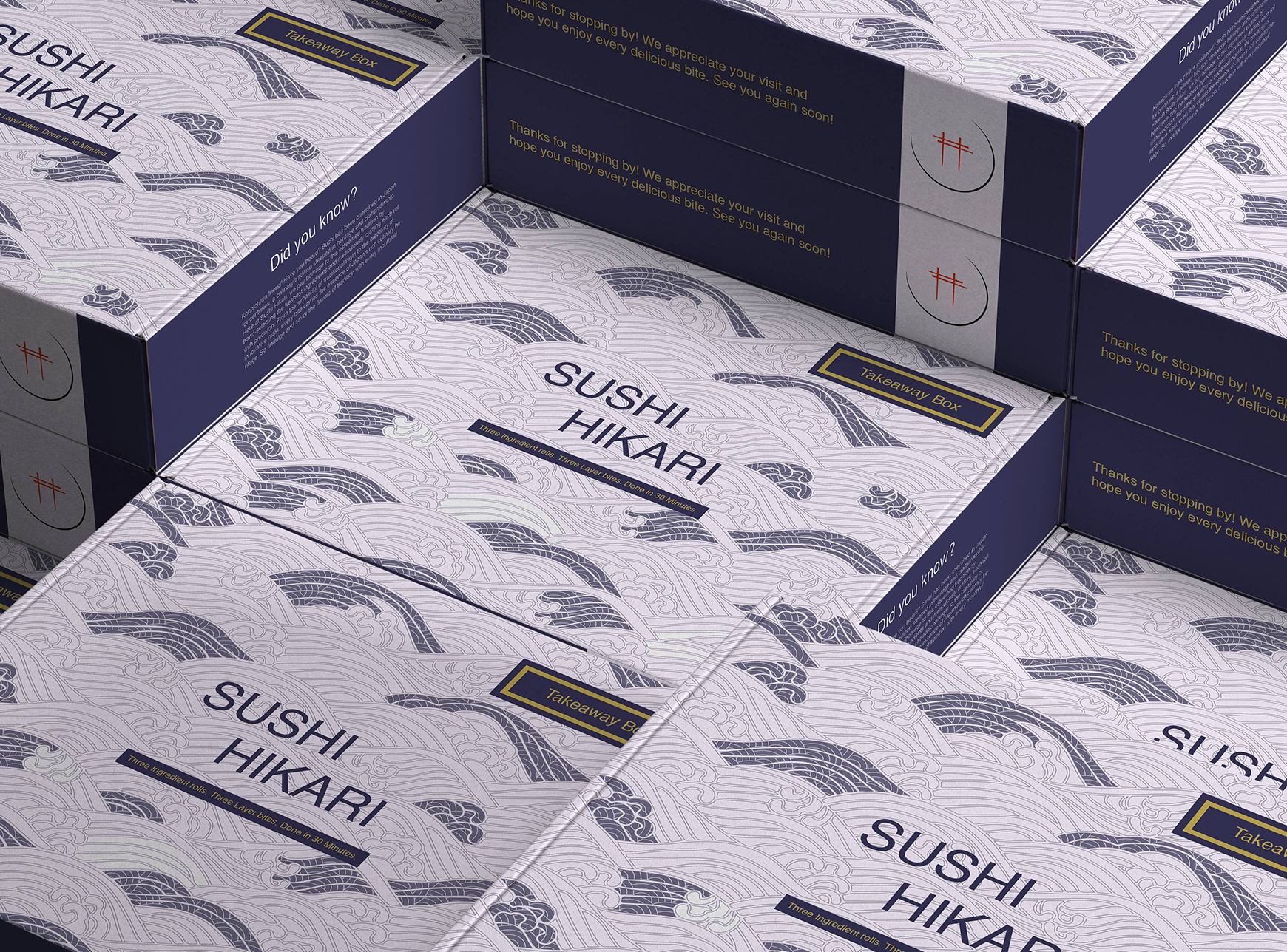
The branding project began with extensive research into traditional Japanese design elements and modern branding trends. The logo was crafted to embody minimalism and authenticity, with subtle nods to Japanese culture.
Color palettes were meticulously tested and selected to evoke freshness, sophistication, and a connection to the brand’s roots. AI-generated visuals were incorporated to create lifelike depictions of staff and interiors, providing a cohesive and immersive brand story. Every detail, from logo sketches to color variations, was iteratively refined to align with the brand's philosophy and target audience.


By creating a strong and cohesive brand identity, Sushi Hikari aims to positions itself as a leader in the premium sushi market. The combination of authenticity, simplicity, and modern aesthetics sets the brand apart from competitors.
This design approach not only appeals to customers seeking high-quality sushi but also establishes a visual identity that resonates with trust and excellence, fostering long-term brand loyalty and recognition.
-min.png)


